The Data Times officially launched in early January 2025, making this our debut year. We've published a total of seven forecasts, some of which were encompassed by the six…
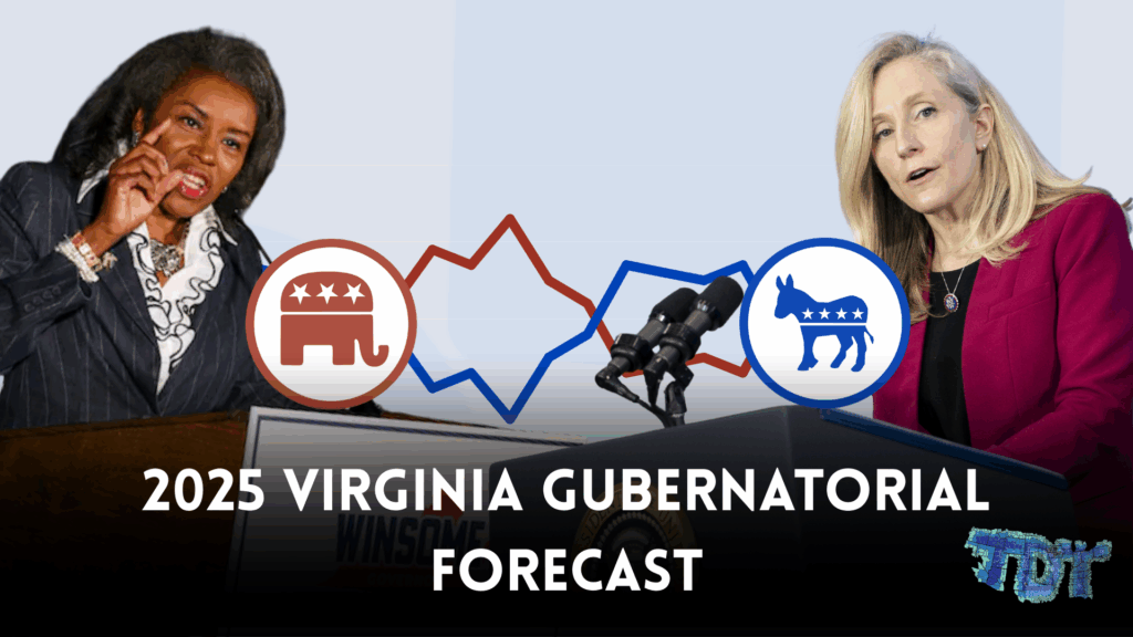
In January, The Data Times released an early poll tracker of Virginia's upcoming Gubernatorial election. A few months later, we temporarily shut it down due to the lack of…
With the nationwide Parliamentary elections in Norway occurring in just over a week, The Data Times has put together an in-depth forecast predicting everything from the nationwide vote share…
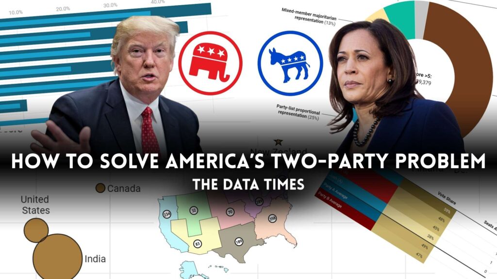
There is a growing demand among America's youth, especially those who identify as Independents, for a new political party in the US. This idea is not new and can…
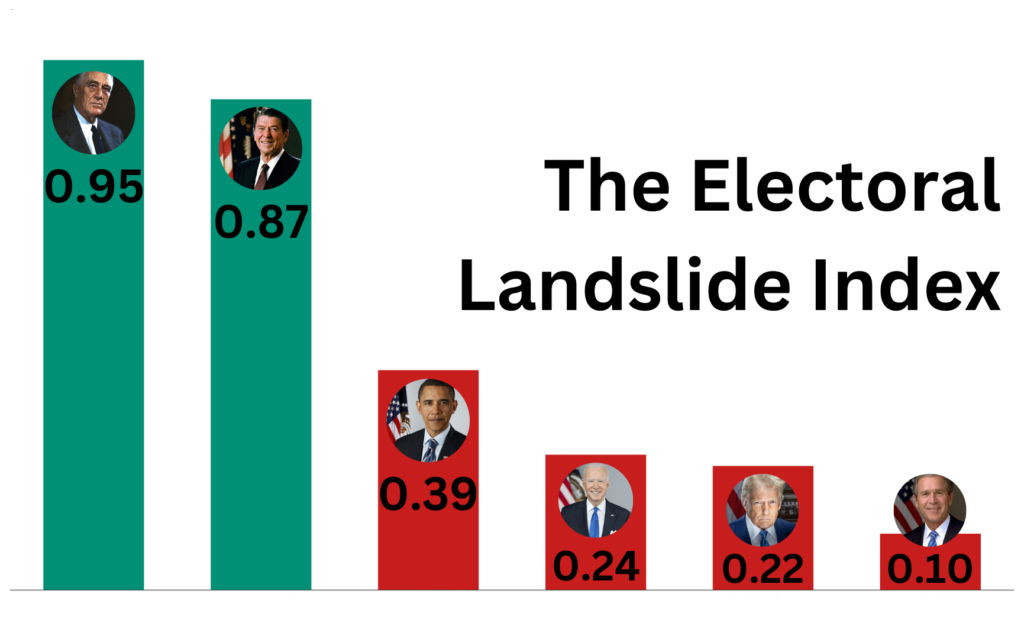
Recently on social media, I've noticed many people try to frame the 2024 presidential election as a landslide. Some people, including Donald Trump himself, also tried claiming a mandate…
This is the first part of a two-part series ranking election models from worst (15th place) to best (1st place). TDT Data Table used to calculate some of the…
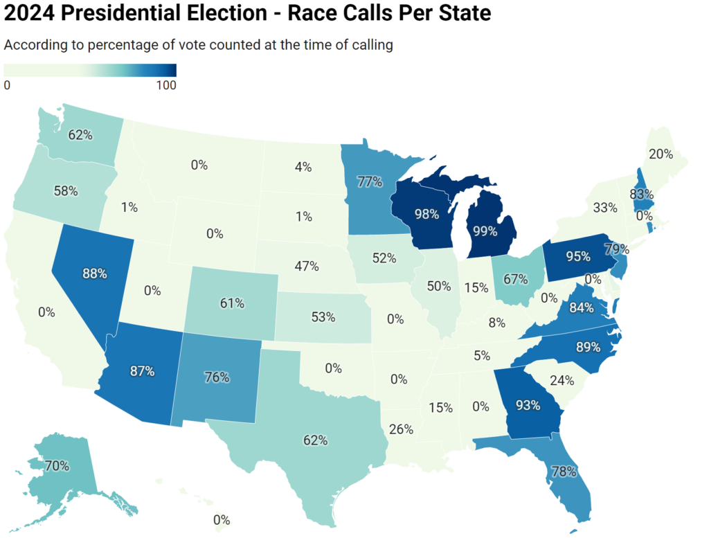
What Is Happening Here? In the 2008 presidential election, the only universally agreed upon swing between the five news organizations used in this sample was Ohio. News sites couldn't…